

Welcome to my site. You can access my posts, models, drawings and articles about my architecture courses on this site. All my courses are divided into separate pages, so you can easily access information about them and me.
One-point perspective and Two-point perspective(Arch 112)
One-point perspective is a drawing method that shows how things appear to get smaller as they get further away, converging towards a single “vanishing point” on the horizon line.


Two-point perspective is a technique in art involving two lines diverging into two separate vanishing points. The two-point perspective definition is based on the definition and use of vanishing points. Vanishing points are the points on a work of art that exist out of view.(Tuesday, May 14, 2024)
Shade and Shadow(Arch 112)
Apply shade & shadow drawings on any drawing that ı have produced for my projects prepared in studio courses.

Shade can refer to any dark area in which sunlight or other bright light is blocked. Shadow refers to the dark shape that appears on a surface when an object blocks sunlight or other light.(Tuesday, May 14, 2024)

M1 (Analysing a building)


1/200 Model Making
This was a very difficult submission because the dimensions were not really specified anywhere. We took all the measurements from the plan and section one by one and proportioned them and did this homework.
Poster Design
The theme of the poster is “Elements of
architecture.”
_ed.jpg)
Description submitted by the project team. The center of Parque México was developed as a clubhouse for a cluster of homes located in one of the fastest growing residential areas in Puebla. The building was designed with two main objectives: to function as a coexistence and leisure center for inhabitants of all ages, and to lay the architectural foundations for future residences within the cluster.
1/100 Plan Drawing
(Hand drawing)


1/100 Section Drawing
(Hand drawing)


Expressive Collage Section

Autocad drawing of plan and section

(Tuesday, May 14, 2024)
TH AutoCAD Drawing


The cover photo I prepared for the porfolio we prepared in the Arch 112 course.(Tuesday, May 14, 2024)

Erimtan Archeology and Art Museum
The photos I took based on the information I learned from the videos on how to take beautiful photos on Coursera that I went to the Erimtan Museum.(Saturday, May 11, 2024) (Arch 112)
THINGY(Arch 102)
To create an environment that can be used by more than one person for different purposes and for different movements, and does not resemble a place that we can all recognize from the outside.(Saturday, May 11, 2024)


This project is related to the project called thingy that I shared above. First of all, we went on a trip to the Çubuk dam and mapped the large land there by walking. We put a lot of abstract and concrete things on the map. Then we came and designed the things called fields that you see below. Normally, all the ropes on it are one of the elements on the map we drew. But then we thought of those ropes as surfaces and placed the projects we call thingy above into these areas to create spaces of different sizes and different purposes.(Saturday, May 11, 2024)(Arch 102)


On Thursday, December 14, 2023, in the Arch 111 course, I would like to receive and evaluate personal blog critiques and share with you the things I need to change.
-Firstly,I need to change the photos that I put on the home page because I found them on the internet and posted them. Our teachers told me that it would be better to post photos that I took or belong to myself.
-Secondly,Our teachers mentioned that my theme was a bit tiring on the eyes, so I decided to put the things I considered very important among my additions on my home page, where I reserved the others.
-Thirdly,since this will be the second grading of our web blog, I will indicate the things I have changed and the things I will add new. I am making these changes on Monday, December 18, 2023.
-(I also removed the background images on my other pages because they did not belong to me and because my teachers said they were tiring for the eyes. on Tuesday, December 19, 2023)
My site's home page was like this before Monday, December 18, 2023, and I replaced the photos with photos I took myself. (I also pay attention to the page layout. We had an assignment to prepare a poster for an exhibition. I think the criticisms I received from there for the Arch 111 and Arch 101 course were very useful.)


Secondly, the designs I changed.
-First of all, since the background in the first picture I posted below did not belong to me, I planned to change or remove it and align the text there with the text below.
-Secondly, I decided to remove the pictures in the second picture I posted below because I found two of them on the internet and since the other one was from the assignment paper, I decided that it was the right decision to remove it.(On the Arch 111 page on my site.)


Changes I made on my other pages: I removed the photos in the background because I received criticism from my teachers that they were tiring on the eyes, the theme was heavy, and the photos did not belong to me.(19.12.2023)


Here we prepared a poster for the Arch 101 course final exhibition.Below I share the first version and the revised version of the assignment.(19.12.2023)


There were a few deficiencies in the revised version, but since it was graded, I could not revise it again, but I learned my mistakes.I want to share these with you.
-The font of the body paragraph should be thinner than the headings, the capital i letters are a funny mistake due to my own carelessness, and there should be no date and venue text, you should also pay attention to these.
ARCH101 JURY 1
MY COMPOSITION

01
02
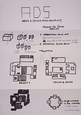
MY ADS


03
Everything I showed
to the jury.


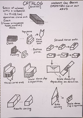
-Carve out,
-Scale up,
-Scale down.


ARCH 101


ARCH 111 Axonometric Drawings


Posterize II

Communication
Ankara Ted Universitesi
0538 089 04 67


